Accessibility on the web is not just a nice-to-have feature. For website developers and eCommerce businesses, it’s our responsibility to make the internet open for everyone. The truth is there is no cookie-cutter visitor for your website. Knowing how to design your site to make sure you are keeping it accessible to all potential customers is important for every online stores.
Join website accessibility expert, Stephanie Glaser as she shows how to make your website available to more people on the internet in our special webinar, How to Design Your Website with Accessibility in Mind.
In this article, we will look at what website accessibility is and what you need to consider for making your eCommerce site easier to access.
Why is website accessibility important?
You may think that the Americans with Disability Act (ADA) only applies to physical locations. However, there are accessibility concerns you should know for your online store.
It may be easy to believe everyone visits your website the same way. However, depending on someone’s ability, situation, or personal preferences, your visitors may be using a variety of software, tools, and devices to access your content, including:
- Screen Readers
- Screen Captions
- Switch Control
- Sensory Switches
- Eye Tracking Switches
- Voice Control
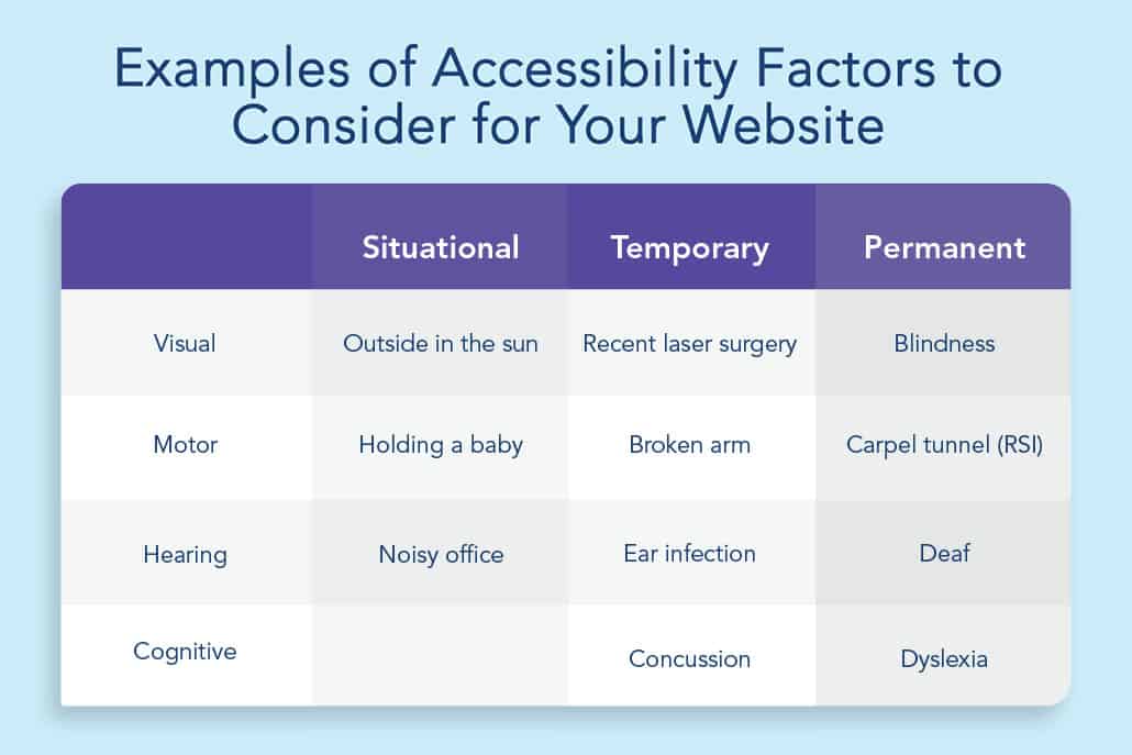
The fact is some of your website’s visitors may rely on these tools due to a permanent disability (such as visual impairment), a temporary disability (like cataracts), or even a situational disability (like being distracted or using a low-quality device).

To make your eCommerce site available to everyone, a website should consider these factors.
What are key benefits of making your eCommerce site more accessible?
Making your website accessible helps make it easier for a larger amount of people to use across a wider spectrum of capabilities. A website that does not follow these standards is like a physical storefront not being wheelchair accessible.
It also provides important benefits to your site and the online community, including:
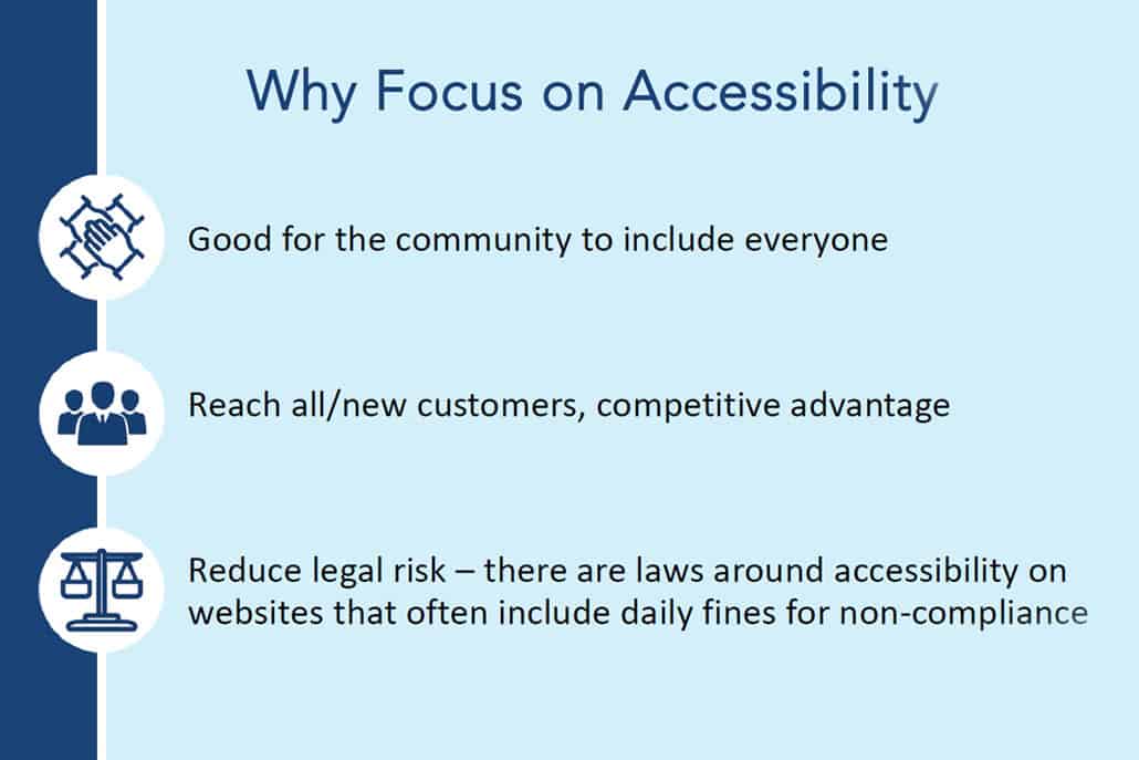
- Bringing the internet to everyone. It is good to involve everyone in the community.
- Reaching more consumers. Reach all or new customers while keeping a competitive advantage.
- Reducing legal risk. There are laws around website accessibility that often include daily fines for non-compliance.

Search Engine Optimization (SEO) Advantages
By using semantic markup of your website, you build your eCommerce site with a meaningful structure to make your content more machine-readable. This not only makes your content more accessible, but also easier for a search engine to index.
For example, semantic markup involves making a heading text into a “heading” element (rather than styling the text to look like a heading) or making a numbered list an “ordered list” element (instead of just adding text with numbers at the beginning).
This is important because different tools, like a screen reader, will tell your visitor the text it is reading is a heading. It also helps the visitor navigate through different headings more quickly. For list elements, the screen reader will tell the user how many items are in the list, as well as which item they are on.
Overall, semantic markup of your content helps convey your content much easier for a search engine. When a search crawler sees a web element properly labeled with HTML elements, it will interpret and prioritize it based on the words and description. For example, a link with the text “Accessibility Guidelines at a Glance” is more helpful than “click here” for someone who can’t see the words. This also helps Google’s search crawler understand your site too.
What are Different Levels of Accessibility?
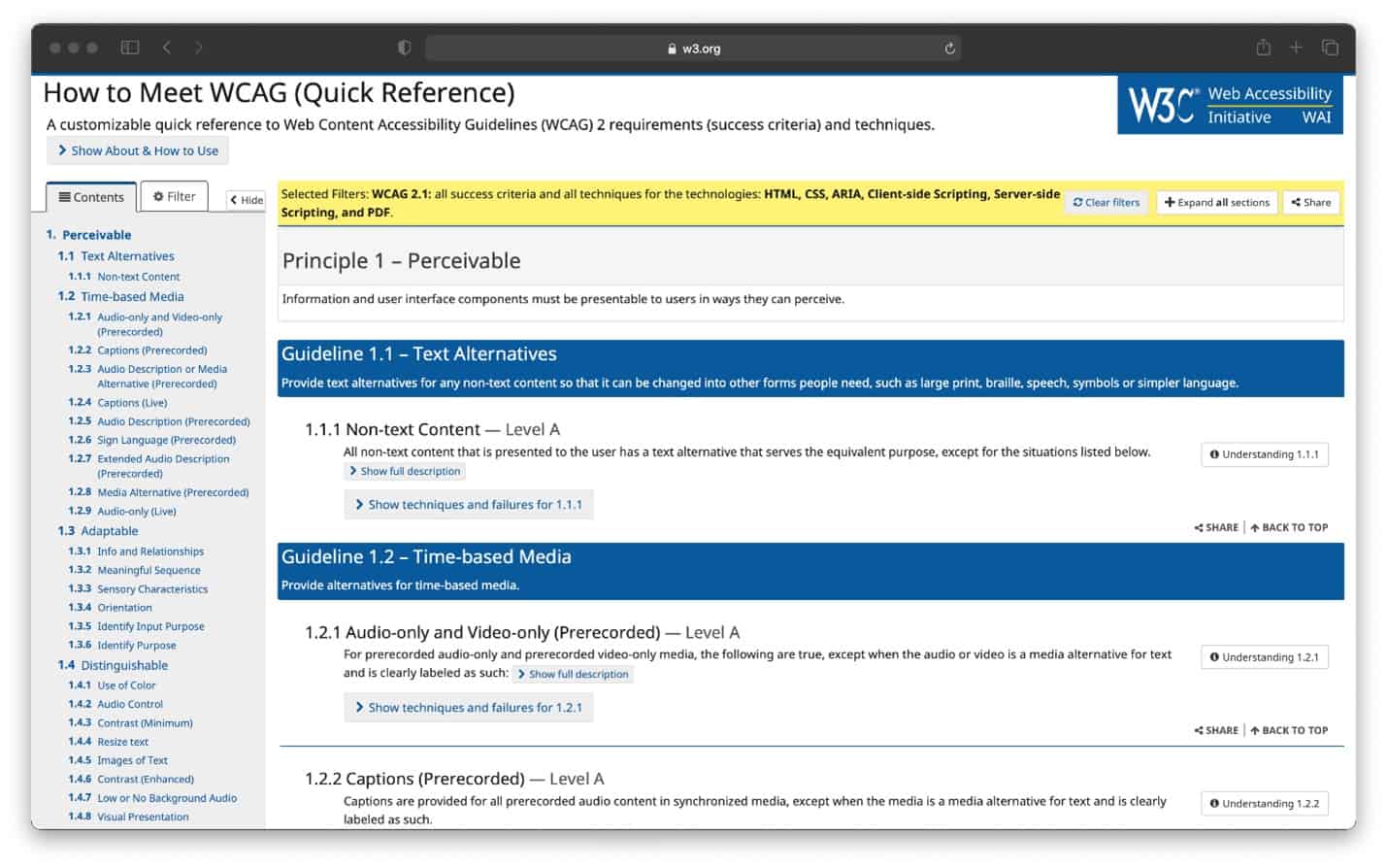
The international community that created the accessibility standards to ensure the long-term growth of the internet is called the World Wide Web Consortium (W3C). The W3C created the 12-13 technical guidelines for authors (website developers, designers, writers, etc.) on how they can build their sites to meet Web standards in the Web Content Accessibility Guidelines (WCAG).
The WCAG breaks down a website’s accessibility into three levels of testable criteria: A, AA, and AAA. Each level is organized by the degree of how accessible a website is and their requirements.
- Level A: Most basic level of accessibility. If your site does not meet the standards at this level, then your site is highly inaccessible.
- Level AA: Moderate accessibility. The minimum requirement used for website accessibility testing. This level encompasses all the basic requirements and is used in lawsuits.
- Level AAA: Highest level of accessibility. By far, the best and most inclusive level of accessibility.
What are the rules to make a website more accessible?
The WCAG guidelines identify four principles in how website visitors access your content. These four principles are:
- All users are aware of the information on a site and no one is prevented from accessing any of it. Ex: Making sure images have text alternatives for users that can’t see the images, that devices like screen readers are reading all the information to users, and nothing is being hidden.
- All users can interact with all the functions on the site to be able to use everything needed. Ex: Being able to navigate to all interactive elements with the keyboard if you can’t use a mouse.
- All users can understand the information your site is presenting. Ex: Users should be able to understand every element on a site and how to use it, such as a form that has a properly labeled text field so they understand what to enter into the field (like in the contact form example in the webinar).
- The HTML must be complete, correct, and able to be interpreted by the browser and assistive technologies (like screen readers). If you have incomplete HTML (like missing brackets or misspelled elements) or you create your own elements instead of using built-in ones, it can break functionality for some devices and make parts or all of the site unusable. Ex: If you decide to not use the built-in checkbox control within HTML, you have to build back all the accessible features which do things like tell screen readers that it’s a checkbox and how they can interact with it or if it’s grouped with other checkboxes, etc.
One basic (Level A) requirement involves assisting users who may need help perceiving images on a website. In this requirement, someone who can’t or has a hard time seeing an image may rely on their screen reader to conceptualize the image. The screen reader reads aloud the image’s alternative text and illustrates a mental picture for your website visitor.

How Do You Test Your eCommerce Site For Accessibility?
One way a website developer tests a website’s accessibility is by interacting with it. That requires learned expertise and doing an audit the right way.
A common tool for testing a website’s accessibility is with the keyboard. The developer will interact and see where problems are. There are also a number of automated validators that help identify some accessibility issues, such as WAVE and AXE. However, these validators will not identify every issue.
During an audit, a web developer checks many different areas. Using the WCAG guidelines, they hit different elements of a website to check its functionality. The developer checks all the menu items, links, buttons, and makes sure the website works together and important places are easily navigable. For an eCommerce site, this may mean testing whether someone can access the cart process.
During an audit, developers are reminded that websites are flexible and should adapt to however your users are interacting with them.
About This Webinar’s Speaker


